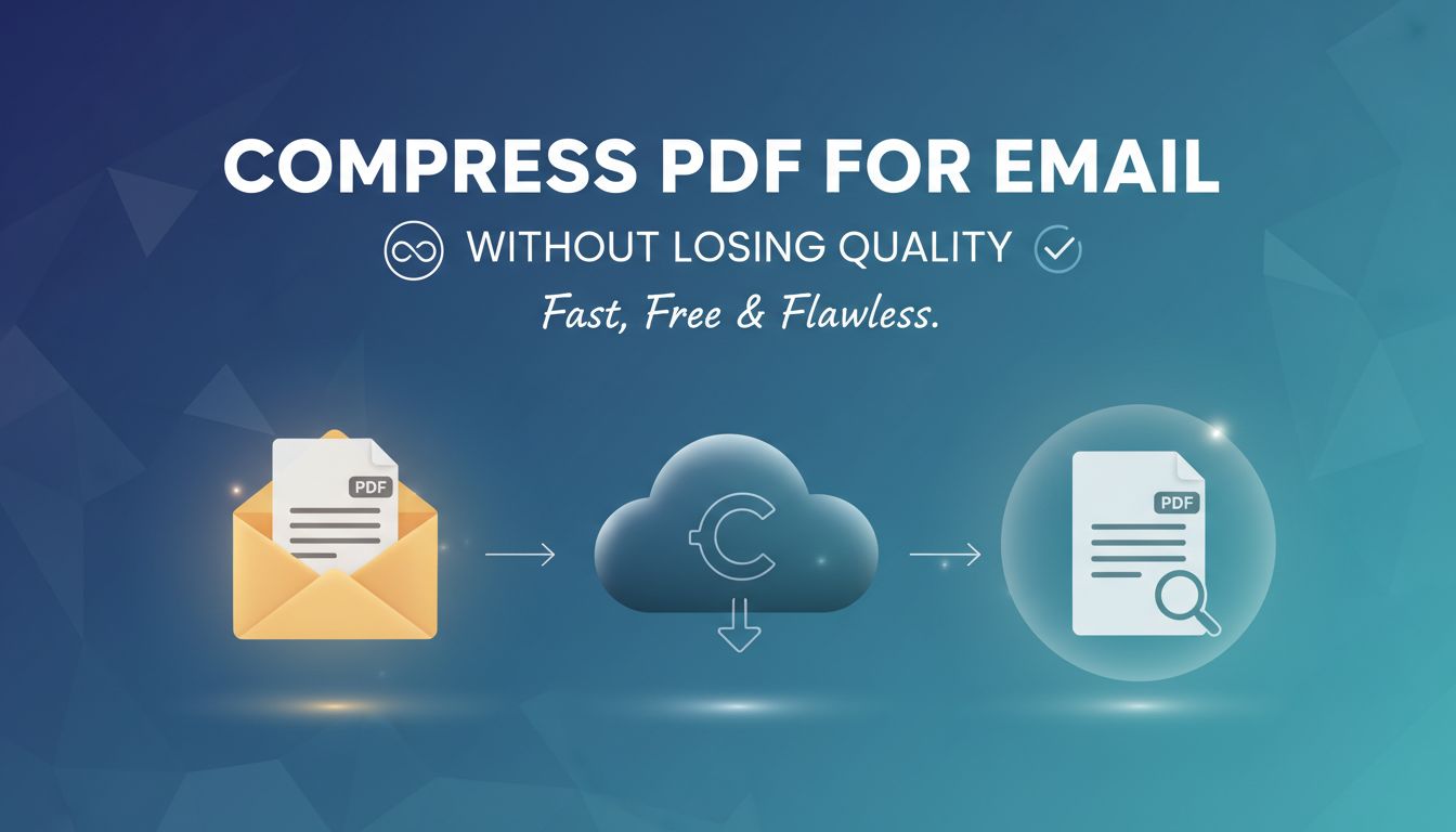
Compressing a PDF for email sounds simple. Until your client opens it and zooms in on a blurry chart that used to be sharp, or a proposal layout that suddenly looks like it was built in 2003.
If you send files for a living, how you compress pdf for email without losing quality is not a technical detail. It is part of your brand.
File size tells a story. You just want to make sure it is the right one.
Why the way you compress PDFs matters more than you think
Most freelancers and consultants only care about one thing when they hit Export. "Will this attach to an email without bouncing?"
That is the bare minimum, not the goal.
What clients really see when they open your files
Your client never thinks, "Wow, what elegant compression settings."
They think things like:
- "I can read this on my phone without pinching and zooming. Nice."
- "The images look sharp when I zoom in. Someone took care here."
- "This looks like a flattened screenshot. Did they rush this?"
Imagine two versions of the same proposal.
Version A is 38 MB. The client grumbles because they have to delete old emails to download it. Then it loads fine, looks crisp, and they forget the annoyance.
Version B is a polite 2.1 MB. It attaches instantly. The client opens it and the main graph, the one you are banking your pitch on, looks like it was printed on a napkin.
Guess which one quietly damages trust more.
[!NOTE] Clients usually cannot name what is wrong. They just feel that something is off, and they subconsciously connect that feeling to your professionalism.
Good compression feels invisible. The PDF opens fast, looks clean on any screen, prints decently if needed, and never hijacks the conversation with technical issues.
How file size quietly shapes your professional image
File size is one of those details that quietly signals how you work.
A few examples your client never says out loud.
- Huge uncompressed PDFs suggest, "I never think about the recipient's experience."
- Heavily degraded PDFs suggest, "I cut corners on quality and do not understand my tools."
- Well balanced files say, "I know how to make my work easy for you to use."
There is also a practical layer.
A 40 MB attachment might:
- Get blocked by a corporate gateway.
- Fail to send from mobile.
- Make your client hesitate to forward it internally.
You want your work to be easy to share, to print, to present in a meeting. This is not about perfectionism. It is about reducing friction at every point where a human can decide "yes" or "no" on your project.
The hidden cost of shrinking PDFs the wrong way
Overcompression feels efficient in the moment. Smaller file, quick send, job done.
The cost shows up later, and not always in ways you can trace.
Blurry screenshots, broken layouts, and lost trust
If your work relies on visual clarity, bad compression is brutal.
A few real scenarios.
- A UX consultant shares annotated screenshots. Compression turns sharp UI elements into mush. The client questions whether the consultant understands design quality.
- A marketing strategist sends a deck with before/after creative. The "after" ads look pixelated. The client secretly wonders how these would look in the wild.
- A financial consultant sends a report with small text in charts. The compression smudges the labels. The investor does not call to complain. They just stop forwarding the report.
Poor compression can also break layout.
Fonts get rasterized, lines look fuzzy, vector icons become low-res images. That careful hierarchy you built between titles, subtitles, and notes becomes harder to read.
The more your work depends on nuance, the more you lose when compression stomps on detail.
When “good enough” compression actually loses you work
Clients rarely say, "We did not choose you because your PDF looked terrible."
They say things like:
- "We decided to go in a different direction."
- "We felt the other proposal was more polished."
- "Your competitor's materials were easier to share internally."
If a decision maker opens a competitor's proposal that is:
- Lighter to download.
- Legible on mobile.
- Beautifully sharp at 125 percent zoom.
Then opens yours that is:
- Slightly fuzzy.
- Annoying to zoom on a phone.
- Hard to print cleanly.
You have created a subtle but real disadvantage.
[!IMPORTANT] "Good enough" compression is only good enough if it preserves the experience of your work. Not just the raw content.
How can you compress a PDF for email without killing quality?
The good news. You do not need to be a print engineer to do this well.
You just need a few rules of thumb, and to stop trusting the "Smallest size" preset blindly.
Quick rules of thumb for clean, client-ready PDFs
Think in terms of use cases.
Here is a simple baseline that works for most freelancers.
| Use case | Target size | Image resolution | Format choices |
|---|---|---|---|
| Proposal or report, screen only | Under 10 MB | 120 to 150 dpi | JPEG for photos, keep vectors for charts |
| Pitch deck with visuals | 5 to 15 MB | 150 to 200 dpi | JPEG for photos, PNG for UI/screenshots |
| Docs that might be printed | Up to 20 MB if needed | 200 to 300 dpi | Higher quality JPEG, no extreme compression |
| Quick review draft | As small as sensible | 96 to 120 dpi | Lower quality allowed, but not unreadable |
Rules that rarely fail you:
- Never choose the "lowest" or "smallest" quality preset for client-facing work.
- Do not crush everything to 72 dpi unless it is truly disposable.
- Keep text and vector graphics as vectors whenever possible.
- Treat key visuals and data charts as sacred. Check them at 125 percent zoom.
Choosing the right compression level for your use case
Most tools use some version of three levels.
- High quality, larger file.
- Balanced, medium file.
- Smallest file, noticeable quality drop.
The trick is not to default to one, but to choose based on what matters more: crispness or speed.
Ask yourself two things for each send.
Will they print this or present it on a big screen? If yes, bias toward higher quality and accept a slightly larger file.
Is this a final deliverable or an in-progress draft? For drafts, you can be a little more aggressive, as long as everything is readable and the main visuals are not compromised.
If you use a tool like File Studio, you can create named presets like:
- "Client final, print-safe"
- "Client review, fast download"
- "Internal only, tiny"
Then you stop guessing every time. You just pick the preset that matches the situation.
Practical workflows freelancers use to stay under email limits
Gmail caps attachments at 25 MB. Many corporate systems enforce 10 or even 5 MB per file.
You could fight that every time, or you can design your workflow so most of your PDFs land comfortably under these caps without drama.
Simple tools and settings that just work
Whatever you use, the concepts are similar. The trick is to know where to control quality.
Common tools and what to look for.
| Tool type | What to adjust | Watch out for |
|---|---|---|
| PowerPoint / Keynote | "Export as PDF" options, image quality | Default may be overkill or too low |
| Word / Google Docs | "Optimize for" and image compression | Word loves to auto compress images |
| PDF editors (Acrobat etc) | "Save as optimized" or "Reduce size" | Do not use "smallest" for client work |
| Online tools / File Studio | Target size or quality slider | Avoid random tools that rebrand assets |
Guidelines that help across the board:
- Turn off automatic "downsample to 72 dpi" if you see it.
- Use "High" or "Medium" image quality, not "Maximum" unless you really need print quality.
- If there is a checkbox like "Preserve vector data" or "Do not rasterize text," keep it on.
File Studio, for example, lets you set a target size range and then preserves vectors and text automatically while working more aggressively on photos and background elements. That kind of smart compression is what you want, so you do not have to micromanage each element.
Smart ways to reduce size before you ever hit “Export”
The best compression is the one you do upstream.
If you are dropping 15 MB photos and 8K screenshots into your presentation, no export preset will magically fix that without damage.
Build these habits into your process.
Right-size images before importing If your slide or page will only ever display an image at 1200 pixels wide, there is no reason to use a 6000 pixel original.
Use the right format for the content Photos and gradients are usually better as JPEG. Screenshots, UI, logos, icons are better as PNG or SVG. Export high quality charts from Excel or data tools as vector PDFs or SVGs if you can.
Avoid repeated giant assets One background photo, used on 15 slides at full resolution, can bloat your final file. Use smaller versions or compress that image once before reusing.
Remove invisible junk Old hidden slides, embedded thumbnails, unused master layouts. They all add up.
[!TIP] A simple rule: if you could never tell the difference on your laptop screen, your client probably cannot either. Downsize images to the largest size they will visibly appear, not their original camera size.
This upstream discipline means that when you hit Export, even "High quality" PDFs stay within a friendly email size.
Going beyond email: setting up a future-proof file delivery system
Once you have your compression workflow under control, email stops being the bottleneck.
At that point, it is worth asking a better question.
Should email attachments always be the default at all?
When to move from attachments to links and portals
For many freelancers, the turning point is when:
- You start sending multi-file deliverables.
- Clients want version history or multiple people reviewing.
- Files include both PDFs and large media like video or layered design files.
Attachments still make sense for:
- One-off proposals and small PDFs.
- Quick revisions and annotated drafts.
- Short reference documents.
They start to hurt when:
- Every deliverable requires you to "split into Part 1, Part 2" to fit limits.
- Clients keep asking, "Can you resend that file from last month?"
A simple improvement is to host final files in a shared location, then email short, well compressed PDFs with links inside.
That way:
- The PDF is light enough for easy sending.
- The client gets a clear index of assets.
- You can update files in the background without resending everything.
Tools like File Studio can help you standardize both the compression and the packaging process. For instance, compress the main PDF, store originals and source files in a workspace, and share a single link from there.
Reusable templates so every client gets a polished experience
Think beyond "how do I get this PDF sent today" and build a repeatable delivery system.
Simple templates you can reuse:
Proposal PDF template Branded, compressed to a known sweet spot, with consistent image treatment and section structure.
Deliverable cover sheet A one or two page PDF that introduces the project, lists deliverables with short descriptions, and links to folders or portals where assets live.
Versioned update format Same filename structure, predictable version labels, and consistent compression style so clients always know what is current.
You can create a few standard compression presets inside your main tools or inside File Studio, align them with these templates, and then stop rethinking it each week.
That consistency does something powerful. It trains your clients to expect a certain experience.
Files that:
- Open quickly, every time.
- Look sharp and legible at any zoom.
- Are easy to store, share, and reference later.
They might never tell you explicitly, but they feel the difference between "random export settings" and "this person runs a tight ship."
Where to go from here
If sending files is part of how you earn money, take one afternoon and tighten up your process.
- Pick one or two compression presets that protect quality but stay email friendly.
- Clean up your source assets so they are not heavier than they need to be.
- Set up a simple system for when to send attachments and when to use links.
You will send fewer panicked "sorry, here is a lower-res version" follow ups.
Your work will look as good in your client's inbox as it did on your screen.
And quietly, in the background, your perceived professionalism goes up, file by file.